
HNFSC: appearance
if your eyes had tongues, this what they’d taste

Welcome back to my series on the Hierarchy of Needs for Food System Change! If you missed the intro to what this is all about and why I’m writing about it, check out this page.
Other than aroma, appearance is likely the first sensory experience when interacting with a food. If it’s a packaged good, like Oreos, then it’s the only one that you’re going to purchase based on. Sure, there are nutrition callouts, but today we’re going to speak more to the form, design and color palettes that go along with the food itself. This spans the Oreo packaging, the touch and feel of the materials, and the form of the Oreo itself. Why are Oreos and other CPGs so enticing? We’ll touch on how marketing entangles itself into the appearance of a product as well! To kick off this base block of our HNFSC pyramid, let’s chat about stalwarts in grocery aisles and how they may have become so mesmerizing.
coca-cola
Coca-Cola is a beast of design and nostalgic resonance. From the design of the bottle, to the script, to the color scheme. Mark Pendergrast wrote one of the books on Coke, “For God, Country, and Coca-Cola”, which catalogs the company from 1886 in Atlanta, to its global reach today. The company benefited from technological innovation at that time, like the crown cap that allowed it to move from soda jerk bars to a shelf-stable product that was shippable far and wide. Coke worked with the US Ministry of War in WWII to make sure that soldiers could have a taste of home on the front lines, serving over 5 billion bottles in the four years that troops battled. This was a marketing tactic that made returning soldiers long for the taste when they returned home, but also landed new markets in Asia and Europe, where troops would share or leave bottles for civilians trying to survive. Coke has always followed the US army and found new markets through its romps in supporting coup d’etats in Latin America or limiting the reach of Communism in Vietnam. These war-torn lands found solace in a cold, sugary effervescent drink that soldiers would shell out.
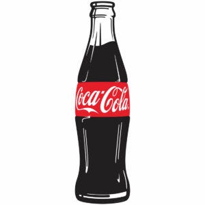
Marketing aside, the bottle is part of the appearance of the drink that people first interact with. Its distinct shape is known only by its silhouette more than any other packaged product out there. Red is associated with increased perceived sweetness which enhances the experience when people go to purchase it. In fact, that’s why you’ll find red tones in many sweets: Twizzlers, Starburst, Skittles, and Strawberry Pop-Tarts benefit from this association as well. You can see how this deep psychological design crossed with nostalgic marketing tactics and military joint ventures makes Coke so impressive, despite the health outcomes of their overconsumption.
kiki, bouba and you
We can see how color, form and nostalgia are powerful in forming a bond with food. Let’s zoom in on this for a second and talk about these elements more, and the impact of language on appearance as well. The way we form words when speaking out loud can have an impact on how we visually understand or expect that food to taste. What the hell does that mean? Well in the linguistic absence of a true meaning behind a word, we can associate the word with certain tastes or textures. The phenomenon that showcases this is called the “kiki/bouba effect” from a psychological study in 1924 by Georgian Dimitri Uznadze. He gave participants nonsensical words and asked them to pair them with six different shapes and explain their reasoning behind it, where there were overlaps of participants choosing the same name for two of the shapes from a list of 42 words. This spurred the more interesting study by Ramachandran and Hubbard in 2001, where participants were given two shapes and two names: kiki and bouba. They were asked, “which shape is kiki and which is bouba?” The study showed 95% of folks selected the curved shape as bouba and the spiked shape as kiki.
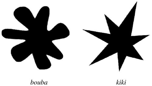
Oh yeah, also half the participants spoke Tamil and the others were English speakers. Studies have gone to two remote Namibian peoples with no written language, and found this holds up, with 82% making the same sound-shape relationship. Others have found that pre-literate children also assign these names with these shapes.
Cool data story Bob — why are we talking about this?
Because this sound-shape relationship extends to flavor and texture in the Western-influenced world as well. Kiki is associated with carbonation, bitter chocolate and coffee as well as spicy. Bouba aligns with still water, creamy milk chocolate and smooth textures and sweetness. The guttural stops of ‘c’ and ‘k’ prompt you to expect Coke to be carbonated, but the curved script gives it this essence of smooth, refreshing sweetness. Tack on the sweet perception of red and you’re creating a powerhouse product before you even pop the top. Think of other products that you have in your cupboard and how do their labels impact your expectation of what’s inside?
visual makeover for our new food system landscape
It’s not easy designing new food products, and even more difficult figuring out how to explain it in a way that resonates with people. The reality is that your packaging and appearance are going to be consumed before someone starts munching, or even if they decide to get to that point and if you want someone to take a chance on eating more sustainable and healthy food, you have to stand out from the other 60,000 items that can be in a grocery store. Now there are a few ways around this and I think that there are a few newer brands that have nailed this.
To start with a lackluster execution, EXO protein bars launched cricket protein bars in 2016. Their packaging rivaled any of the protein bars in that space, but it still was a brick when you unwrapped it. I bought them when they were being pushed on the Tim Ferriss Podcast 8 years ago and enjoyed them, but what was I actually getting? They didn’t shy away from their main ingredient and leaned into crickets on design points. Insects were in the food zeitgeist in 2016 with noma putting ants on shrimp, releasing a book on insects, and even a gin that used ants as a botanical. I still don’t think of this as a fad, rather a trend with a long event horizon.
Despite that, the association with “exo” isn’t normally a pleasant one in my experience. Even the sound of saying it aloud doesn’t conjure a satisfying taste to mind. It’s technical. It makes my skin crawl and doesn’t make me excited about the sustainable future food system I’m going to be a consumer of off the bat. Their typeface is very angular, which clashes with my idea of a smoother texture of a protein bar. Since their acquisition in 2018, they changed any cricket verbiage to its latin genus: acheta. It’s a good move to get people interested, but it might as well be lipstick on the pig of getting into entomophagy.


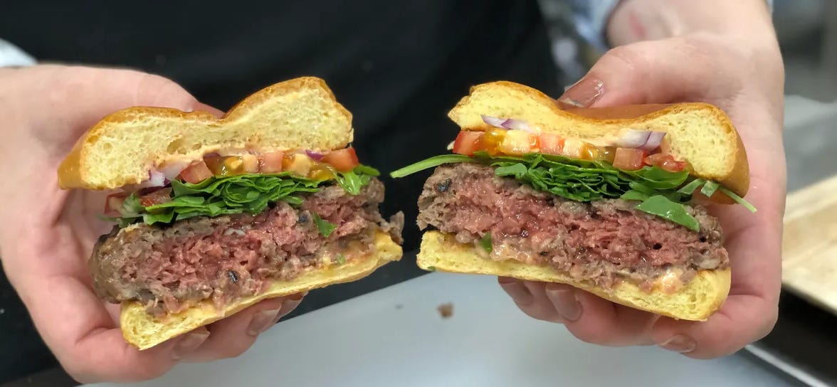
On the other end of the spectrum, Impossible Foods drew in the meat-eating crowd by making their burger the “burger that bleeds”. No matter how disturbing it is that a soy patty is leaking leghemoglobin,it’s the visual that meat-eating folks needed to try something potentially more sustainable. It is odd that they chose blue for their branding since that color tends to suppress appetite and is wholly unnatural in almost all known natural foods, but by using the route of working with chefs like David Chang and prolific food writers like Harold McGee they could showcase this novel element of the plant-based movement with trusted folks. I think this and waiting to launch in retail for another 2 years after their food service debut, gave them mystique and FOMO that drove people to keep their eyes peeled on menus.
Although appearance, naming, and design are heavily invested in in small companies and restaurants, I can’t overstate how important these decisions are in positioning your product. You eat with your eyes before you smell or taste, and if you don’t get the visual right, you can write off anyone getting to those two senses.